

Nike and the NBA released their City Edition uniforms for the 2021 season! You know what that means — we’re ranking them all. I put all 30 28 new uniforms into four emoji tiers. We’ll also be checking in with Jeremy Kroening for his thoughts.
There seems to have been a concentrated effort to call back to the mid 1990s, arguable the most diverse and divisive era of NBA uniforms. Teams were trying out all sorts of colors, fonts, and styles that were made fun of at the time. But we crave nostalgia, so without further ado:
💩 Tier
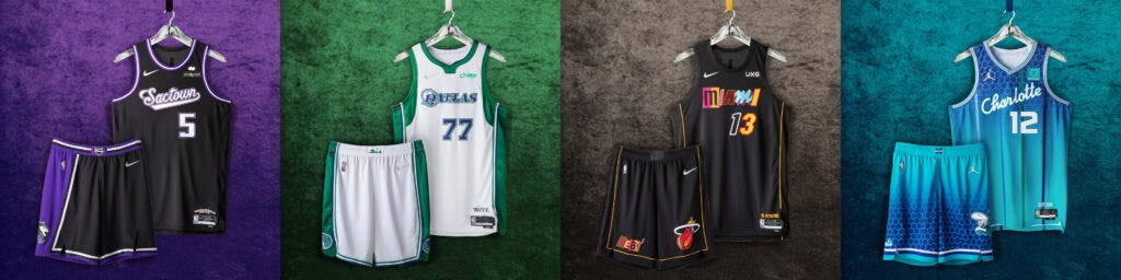
These four are bottom of the barrel. I’m having a hard time figuring out what’s going on with each. Black and purple is already a bit questionable, but putting “Sactown” in script letters across the chest makes the Kings even less redeeming. Dallas has been flirting with the green jerseys and cowboy logos for a couple years now, but this one feels like there’s too much going on.
Speaking of too much going on — uhh… hello Miami? I get it — different pieces of past uniforms combined into one. The Vice jerseys, the original bright reds and yellows — this looks more like a mysterious note left behind from a bad TV criminal. The Vice jerseys were perfect, man. As far as Charlotte goes, I get that they want to stand out and keep the teal/blue combo — but the honeycomb look just isn’t it. They’re wasting their old Hornet logo on the shorts.
Jeremy: “Sactown” is an unintentionally hilarious self-diss. Miami, pick a font, pick a color. Come on.
🤨 Tier
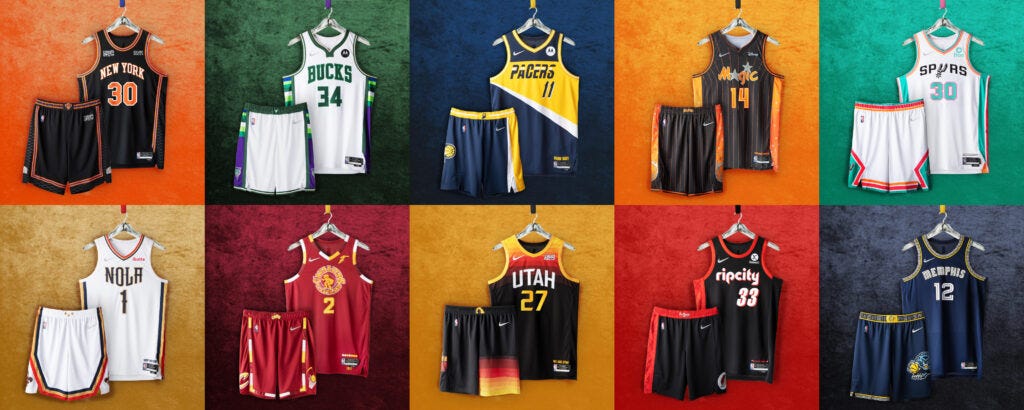
A whopping one-third of the league’s jerseys find themselves in the 🤨 tier. Utah’s allegiance to making their jerseys look like the Buffalo Wild Wings menu is almost as baffling as Orlando’s attempts to make orange a tertiary color. San Antonio’s are a bit too minty for my liking. New York, New Orleans, Memphis, and Portland all just look like sleek extensions of their main jerseys.
The Cavs and Pacers, once again, have a bit too much going on. But I feel like I can be convinced that their jerseys will look better once we actually see the players in them. Milwaukee’s last-ditch attempt to bring some purple back into their uniforms falls a bit flat.
Jeremy: The Cavs circle “cavalier” logo is terrible — it looks like a guy is bending over and farting out an S. Is Orlando’s black? Or is that a dark navy? Either way — Orange???
👍 Tier
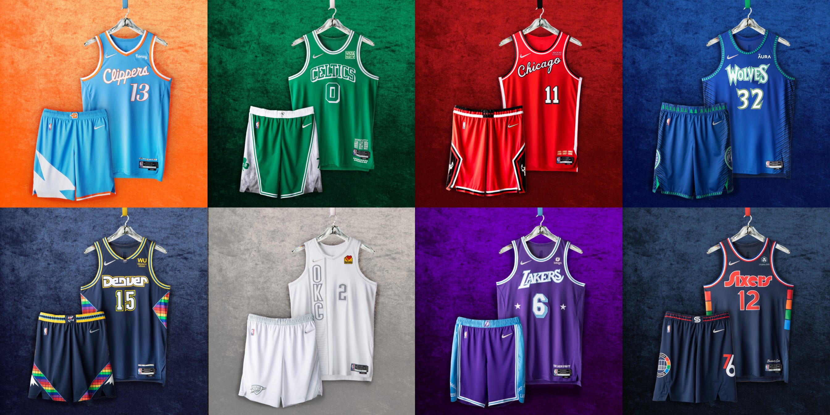
Here’s where things start getting good. The Clippers make that baby blue and orange combo look so damn good. The Celtics redeem themselves after failing miserably over the past few years. Chicago stays true to their roots, and Minnesota brings back the Garnett-era blue and green kit with the old wordmark.
Denver’s original rainbow look was awesome. These are a bit funky (and similar to Philadelphia’s) but I can rock with the square designs. The Lakers uniforms are an awesome retro, combining eras — and I hate to say it, but the light blue and purple works for some reason.
Jeremy: The Clippers have the best jersey — simple, hits close to the old Heat “vice” unis, nice light blue/light orange mix. Chicago’s throwback to that early Jordan style, mid-80s vibe is actually pretty dope.
Oklahoma City’s Durant-era navy blue and white uniforms are among my all-time favorites. These are simply the monochrome version of the same jerseys, which I like. I wish Love’s wasn’t so annoying and would let their logo be monochrome, too. These are some excellent jerseys, which means the next tier of uniforms are even better…
🔥 Tier

The top-8 this year are the best of the best. These really are some of the best uniforms we’ve had in a while. Let’s go through each one.
Atlanta’s immediately stands out because of the redemption of that awful, full-torso spanning hawk. With the yellow to lighten everything up (and incredibly awesome shorts), the Hawks saved their late-90’s look and made it as bright as their future. Perfect.
The Nets come back this season with a re-up of last year’s City Edition kit. Stars and stripes on one side like their original ABA uniforms, but with the navy and red combo that came about in the early 2000s. I think I like it because it just looks like a uniform Kevin Durant will score a trillion points in.
Toronto brought it all back — the dino logo, the pinstripes, the championship black and gold look — and it’s one hell of a uniform. The Wizards have had historically bad, dark uniforms (except for the Gilbert Arenas-era gold jerseys, which I irrationally love), and this one is bright and beautiful.
/cdn.vox-cdn.com/uploads/chorus_asset/file/19933071/72936173.jpg.jpg)
The Rockets brought it all the way back to the ’90s, too. This is a jersey I can just imagine Jalen Green skyrocketing over a helpless help-side defender. And I can’t sleep on the McGrady-Yao era red and white logo accents on the shorts. Just a completely awesome jersey.
The Warriors have lightning bolts, and I don’t hate it? They always look awesome in black jerseys. Loving the no-name look and just keeping it simple. Often, less is more.
Jeremy: Golden State put lightning bolts on the sides? What? Why? The Houston jersey makes me think of old fat Houston-era Barkley, followed by the Stevie Franchise/Cuttino Mobley era (not good years).
The Pistons, unlike the Warriors, have worn lightning bolts in the past. These are also the best red jerseys Detroit has worn since the Grant Hill-era 1990s. And yes, that’s teal smushed in between the red and blue — and it works!
Phoenix pretty much brings back their City jerseys from last year, and I won’t penalize them for it. They’re by far my favorite uniforms in the NBA, with the purple and orange digital gradient seeping through the torso and shorts. A non-intrusive sponsorship patch with championship-contending team to match. It’s important to save your best jerseys for your best years, and they’ve done just that.